A CARE BOOKLET
AGENCY: AXENT, INC.
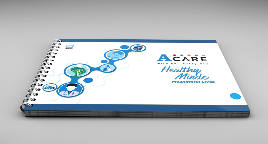
When the subject is mental health, how information looks and feels matters as much as what it says. The A CARE Booklet was created to help caregivers better understand psychological conditions—through clarity, empathy, and approachability. At the time, the team needed support in shaping the overall direction of the booklet, and I led, with the guidance of our executive creative director, the project end to end. I handled the creative direction, defined the visual style, and developed the copy—ensuring that content and design worked together as one cohesive system.
*Images are from Axent, Inc.’s website
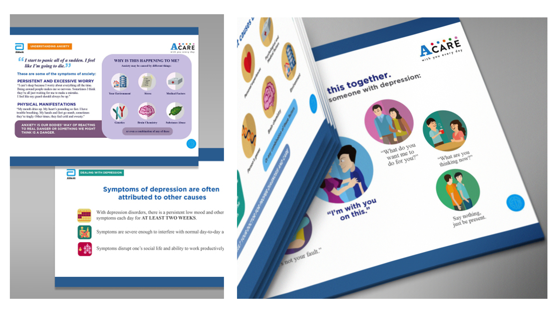
The booklet used a vector-based illustration style paired with some speech bubbles and simple visual cues. This approach helped:
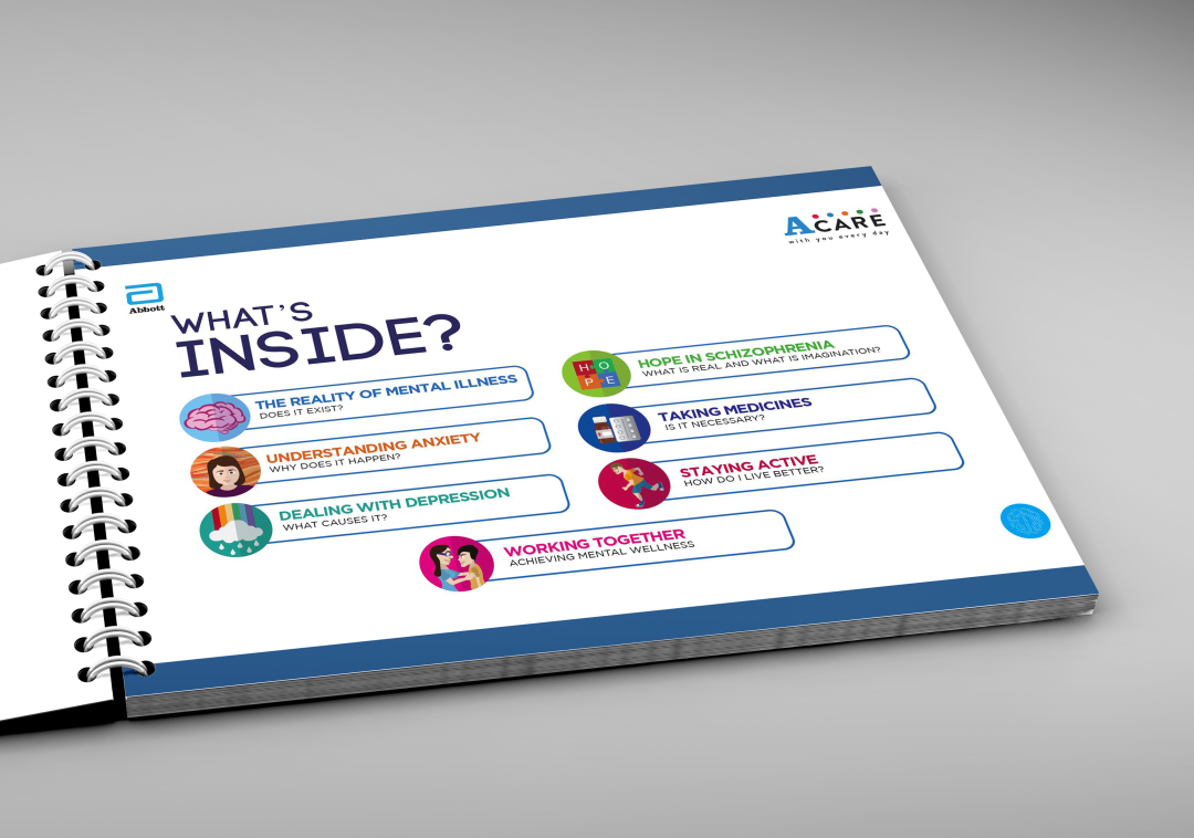
- Break down complex mental health concepts into digestible moments
- Humanize clinical information without oversimplifying it
- Create a friendly, non-intimidating reading experience
Typography and layout were kept clean and spacious, while the copy remained short, conversational, and easy to scan—designed for caregivers who may be emotionally and mentally overwhelmed.
DESIGNING FOR UNDERSTANDING
This project reinforced that art direction isn’t just about aesthetics—it’s about responsibility. By shaping both the visual language and the flow of information, I learned how thoughtful design can lower emotional barriers, encourage empathy, and make difficult topics easier to engage with. ACARE became a reminder that good art direction can create not just clarity, but care.
